1
Making students and staff aware about association's services.
2
Retain existing users and increase the website traffic organically
3
Writing clear and concise content to help users understand CCSAI services better
4
Re-designing the information architecture of the website to help users navigate efficiently
To carry out the project in a more organized way, I divided the project in phases. Phase 1 focused on Content Audit and Phase 2 focused on overall redefining the information architecture of the website.
Phase 1: CCSAI Content Audit
Phase 2: Restructuring Information Architecture of CCSAI’s Website
To begin the project, I started with digging into website analytics to gather data about which pages and sections the website users are focusing more on. Overall, understanding how the website is performing in terms of user session.
The major focus here was to carry out primary research and understand the website's target audience and define important information users might be looking for. Additionally, the data helps in knowing ways I can organize the website information.
Next up, for competitive analysis I focused on understanding the content on the websites of other student associations. Some of the competitors I referred to:
Sheridan Student Union
Ignite: Student Union for Humber Polytechnic and University of Guelph
Conestoga Student Inc
Outcomes:
The content structure and overall organization was focused on the users’ needs.
Overall, website navigation was easy and guiding in which direction to move.
The voice and tone of the website is guiding and helpful.
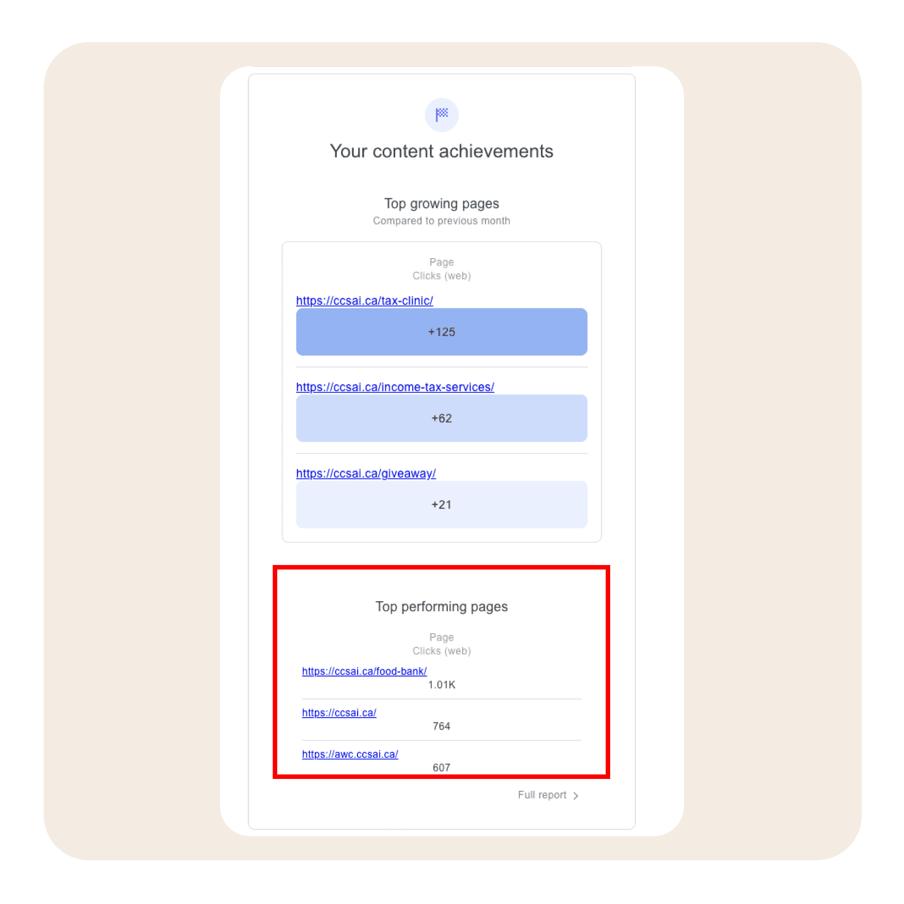
The main aim of the content audit was to focus on finding the content gaps and ways we can bridge it by making the content more clear and concise. Another focus was to have a clear understanding of the target audience in order to know ways I can organize the information. For example, while segregating the website analytics data, some of the important information we found was the most frequently access pages in order:
Food Bank Request
Lawyer Appointment
Events Page
Clubs Page
This information helped us to understand our users and their expectations better.
Restructure the Navigation menu as the current website navigation has plenty of sub-menus which in turn increases the cognitive load of the website.
The events detail page lacks event information and is not much helpful to students.
Many sub-service pages didn’t have important information in regards to that particular service. As a result, these pages were of no help.
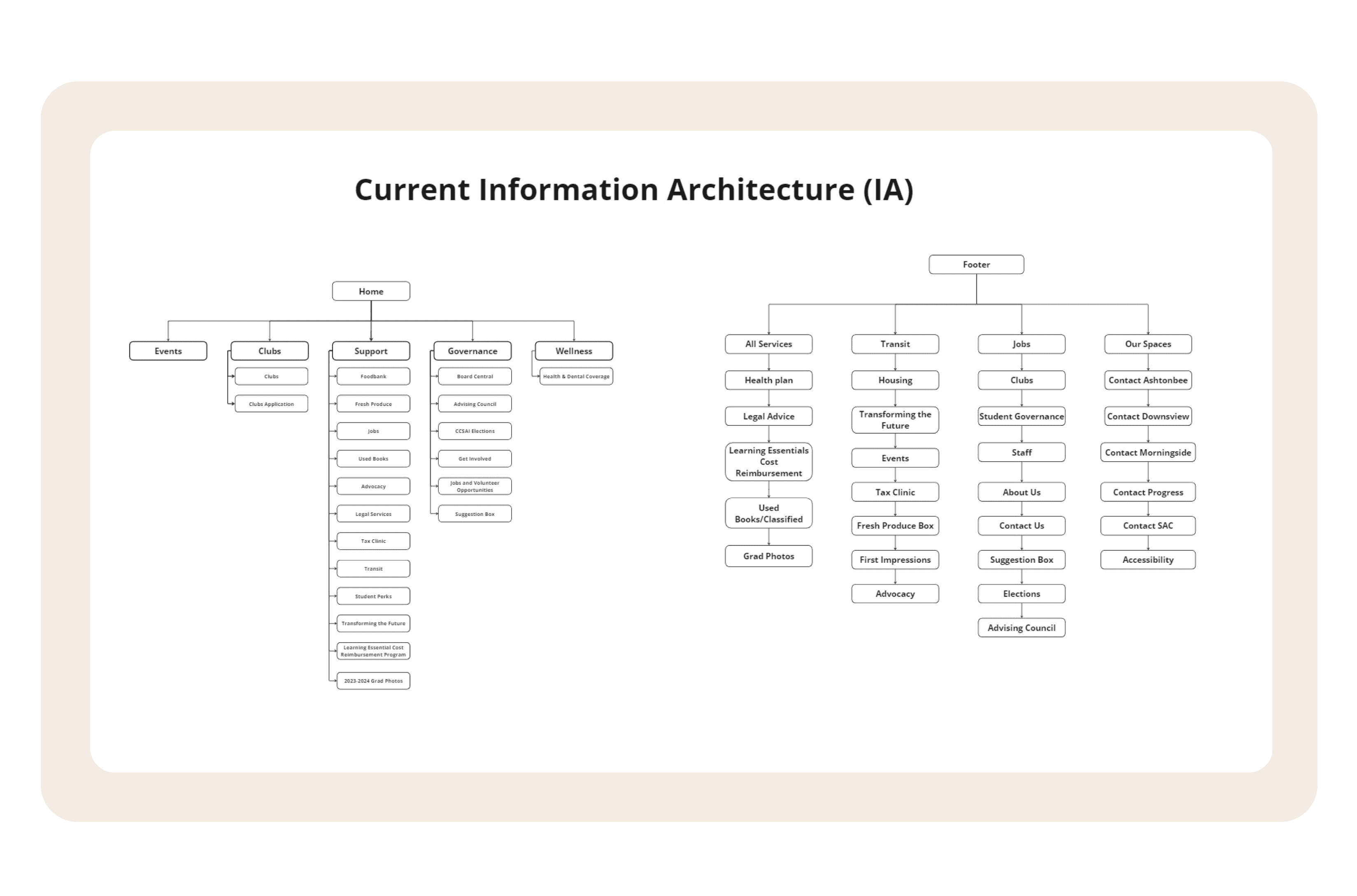
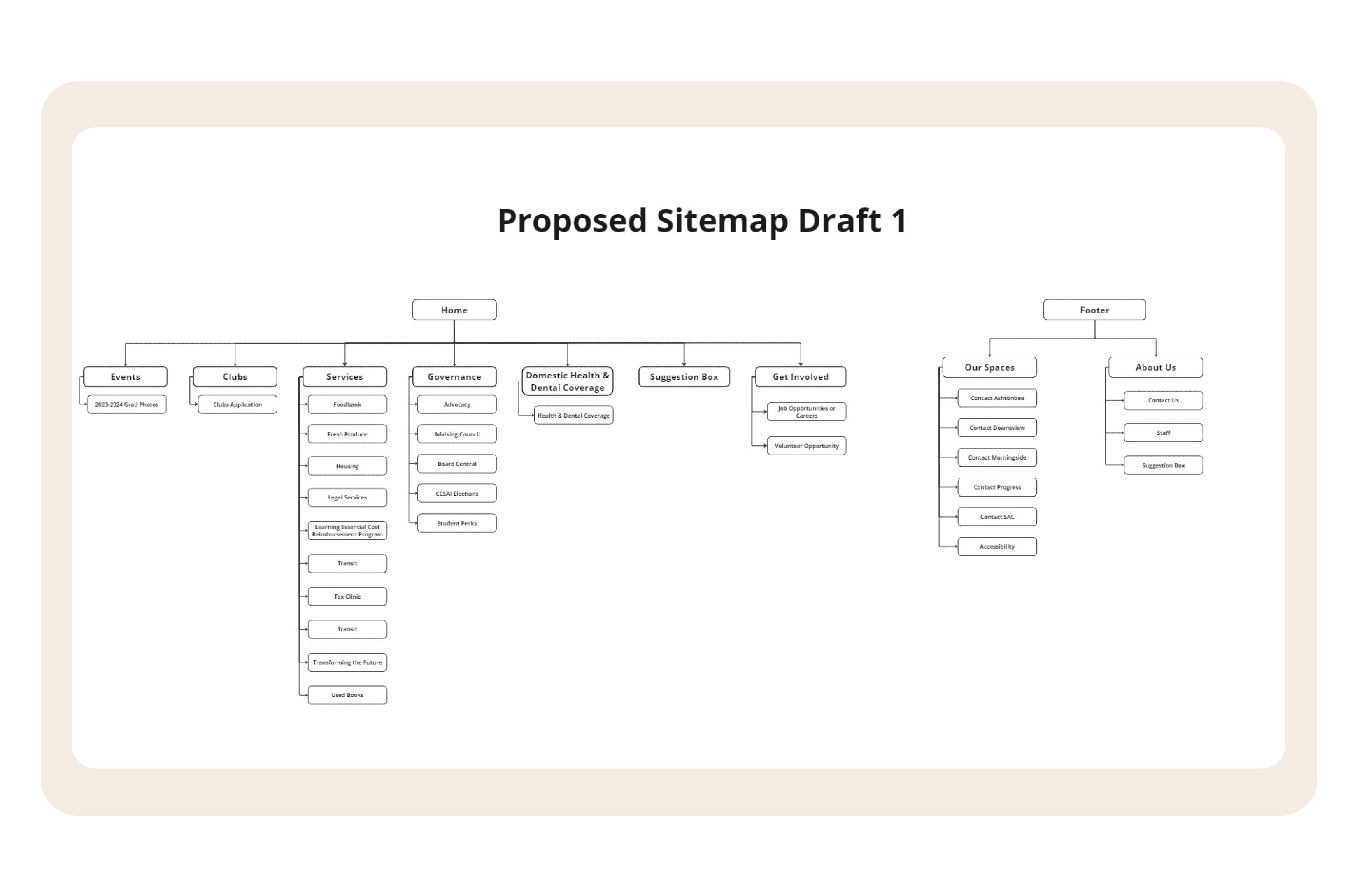
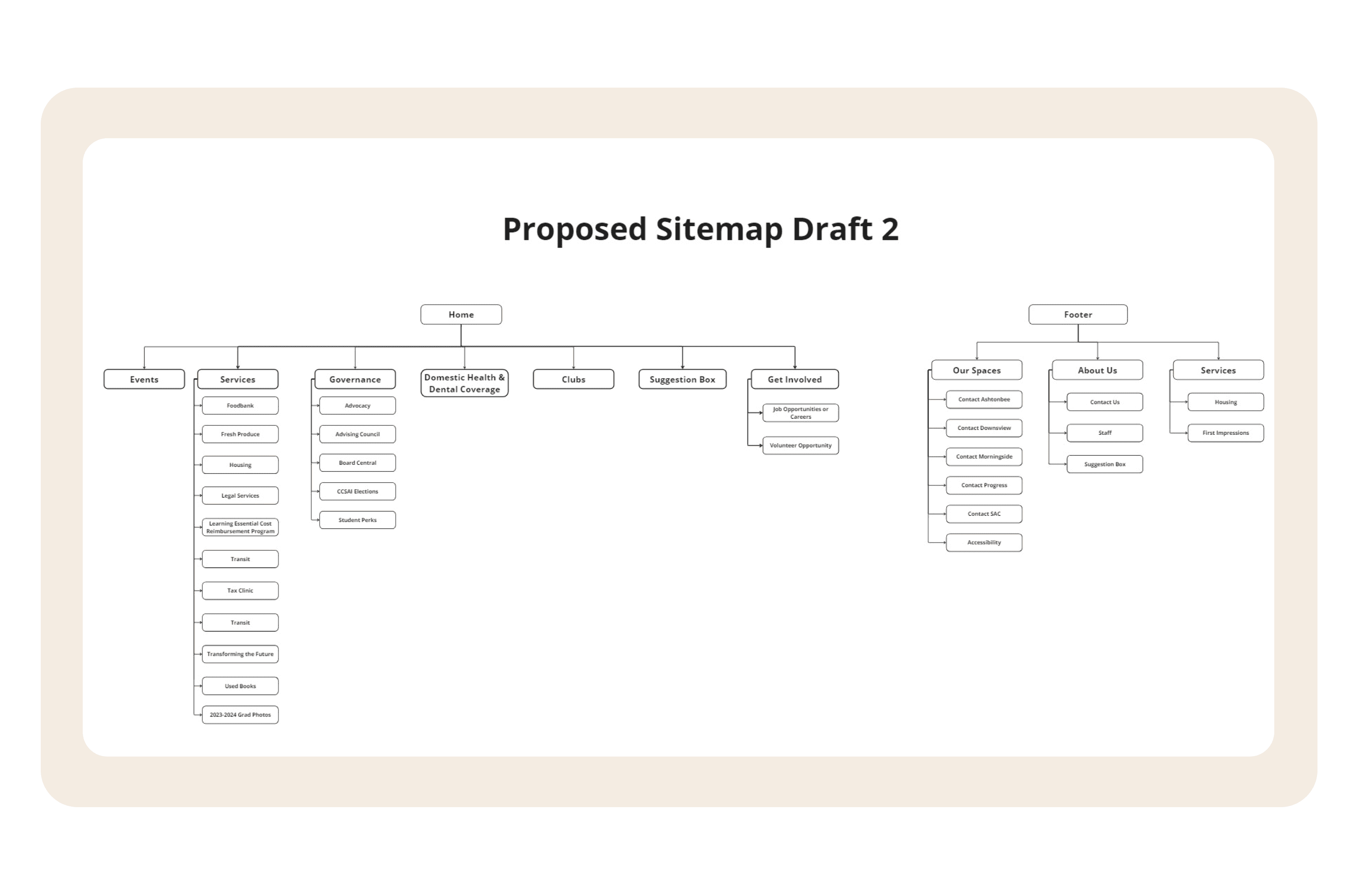
The second phase of the project focused on restructuring the information architecture/sitemap of the website. The main cause of re-doing the website navigation was that the existing website had plenty of menus and sub-menus making it difficult for users to navigate the website. Additionally, too many options increased cognitive load on users as a result of which they might abandon the website completely.
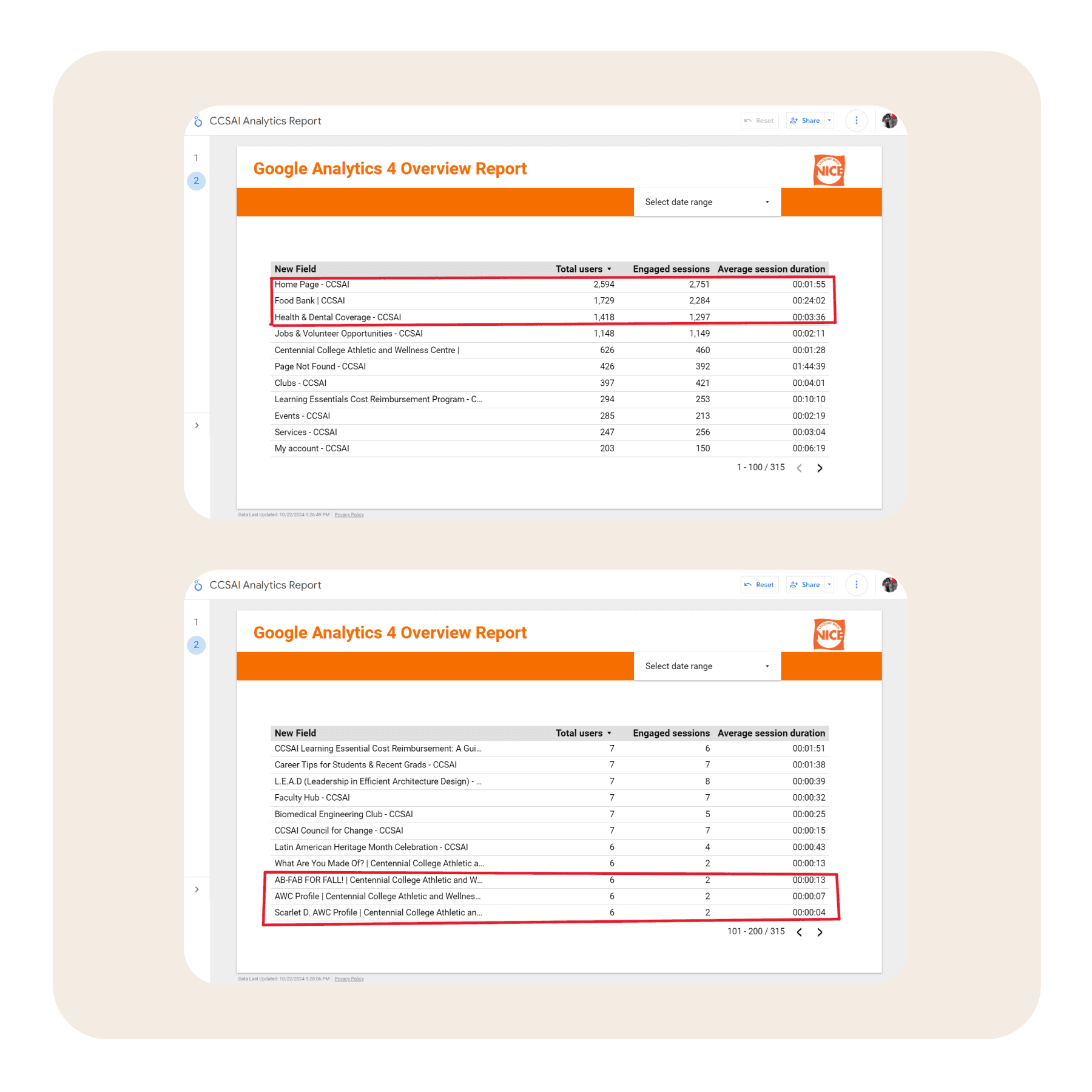
I started with understanding the google analytics data of the website. In order to know the website’s performance, understand the average session duration of users. The aim of gathering this data was to translate it into making the new website navigation user-centric in order to achieve business goals.
The above data reflects the highest and the lowest web pages visited by users, average session duration, and number of users visiting these web pages. Top 3 major findings from the analytics was:
When redesigning the website’s information architecture, it helped us to understand which web pages needed to be prioritized over others.
It also helped us to highlight which CCSAI services users need more information about. As a result, making sure that the content and layout of these web pages are catered to users’ needs.
Focus on removing redundant information from footer navigation and make it concise.
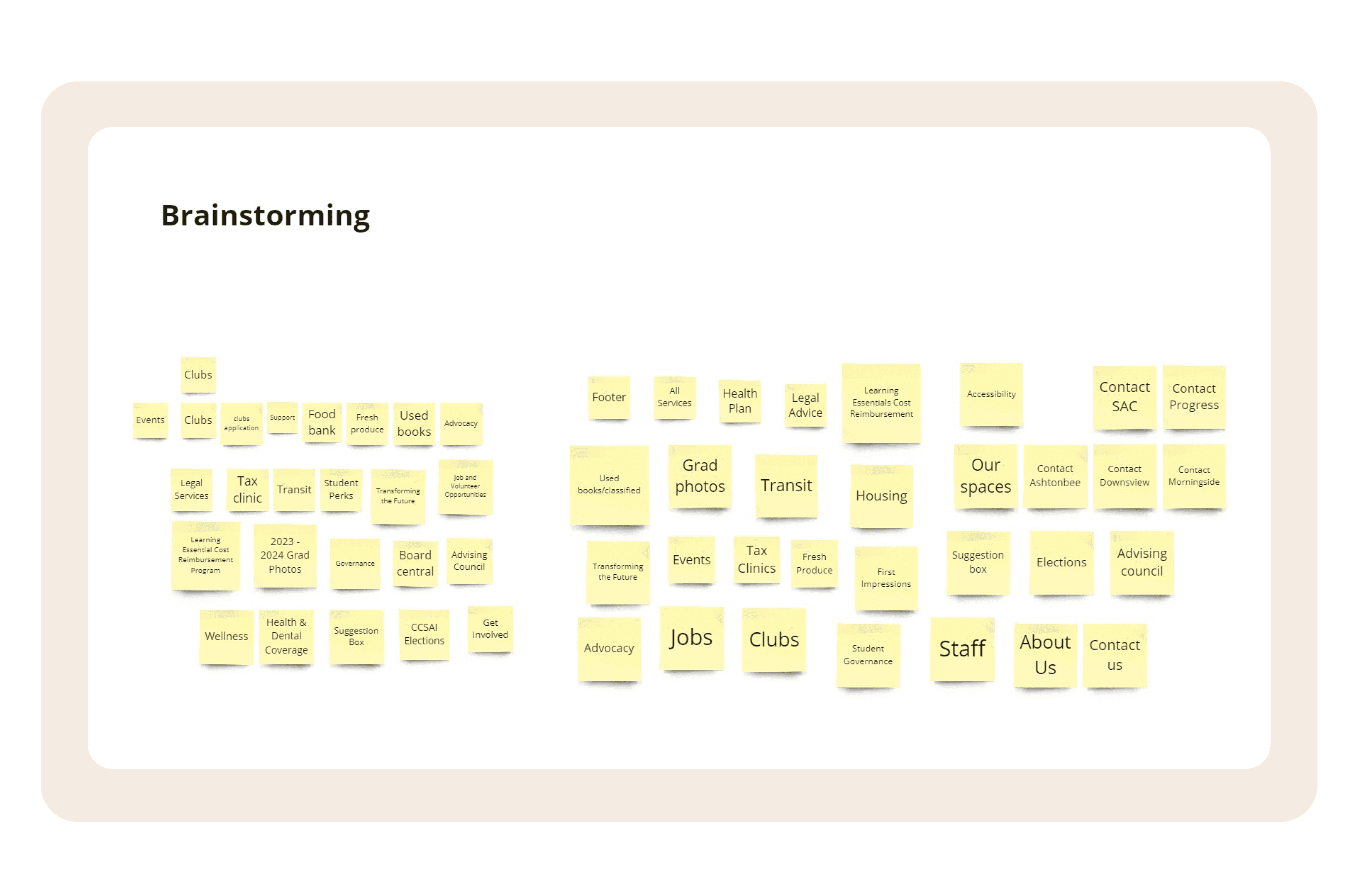
I started with first drafting the current website’s sitemap and trying to find the loopholes and ways I can trim down the menu. Based on the analytics information and frequently used pages, I drafted 2 plausible versions of the information architecture.
1
Creating content strategy keeping user and business needs in mind was a gap I was trying to fill. One of the biggest learning I had was ways to focus on making the content clear and concise while keeping the overall website layout and design in mind.
2
Trying to make necessary decisions around what will help users navigate in the right track and will make them abandon the website was a tough cookie to crack. However, interviewing users and understanding their needs made it clear.
3
I also got an exposure to share my work with stakeholders and present them with the content strategy and overall justification behind it.
Figma
Miro
Google Analytics
